

Published Nov 18, 2026 | 9:00 AM ⚊ Updated Nov 18, 2026 | 9:00 AM

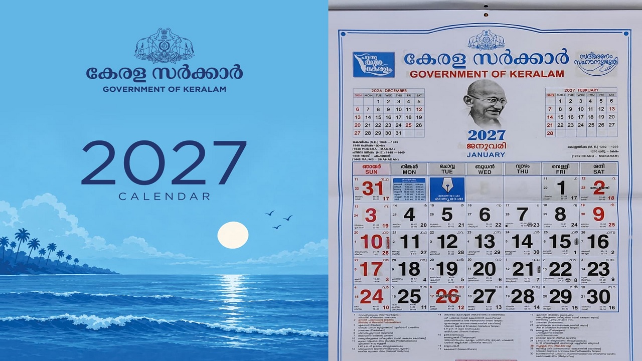
Keralam's government calendar

Synopsis: Keralam’s government calendar has undergone an artistic makeover, trading its traditional red-and-black look for an elegant royal blue identity. Behind the redesign is artist Arun Gokul, who sought to translate the government’s ‘Puthuyuga Keralam’ vision, blue economy and Mission Samudra into a simple yet striking visual narrative. The calendar recorded sales of over 1.82 lakh copies in its first 10 days.
The practical use of physical calendars may have diminished somewhat in recent years, yet Keralam’s government calendar for 2027 has set a sales record with a striking new look. Its royal-blue cover, featuring a minimalist seascape, marks a departure from the familiar red-and-black design.
A palm-fringed coastline and rolling waves form the backdrop, while the words ‘Good Governance with Empathy’, the new government’s motto, occupy a prominent place.
The Department of Printing sold 1,82,836 copies between 1 November and 10 November, surpassing the 1,78,283 copies sold during the entire previous sales season, which ran from November to February.
Behind this visual transformation is 45-year-old designer Arun Gokul, whose career spans book covers, cultural events, film festivals and institutional branding.
With more than 1,500 book covers to his credit, he approached the assignment with a question that was as much artistic as practical: How could a government calendar, traditionally considered a rather functional publication, become something people would enjoy looking at every day?
Speaking to South First, Arun said the Chief Minister’s Office approached him with the assignment, marking his first opportunity to design a government calendar.
For Arun, the challenge was not simply to change the colour scheme or create an attractive cover. A government calendar comes with its own limitations. Unlike a book cover or an exhibition poster, it has a predetermined purpose and a familiar format that people have grown accustomed to over the years.

Arun Gokul
“People buy a calendar primarily to see the dates and holidays. There isn’t much scope to experiment with its content. I wondered what an artist could actually do with a calendar like this,” he told South First.
The scope for artistic expression was therefore largely confined to its visual identity. Arun began by working on two logos, ”Good Governance with Empathy’ and ‘Puthuyuga Keralam’. The idea was to give the government’s vision a distinct visual representation without disturbing the calendar’s essential character.
He prepared five designs and presented them to the Chief Minister. The royal blue concept, which eventually became the final choice, was built around the government’s focus on the blue economy and the coastal development agenda.
The cover translates these policy priorities into a visual rather than an elaborate political statement.
The blue sea, the shoreline and the gentle movement of the waves give the calendar a distinctly coastal character. The colour also lends the publication a sense of calm and elegance, setting it apart from its earlier appearance.
Arun said the Chief Minister was confident about the direction and offered suggestions, including corrections to the logos. The final design retained the simplicity he had originally envisioned.
The choice of blue has also drawn political interpretations, with some associating it with the Congress and reading the calendar’s design as a reflection of the ruling party’s political identity.
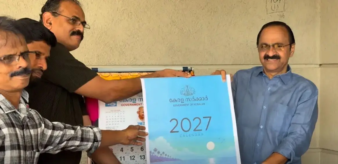
Chief Minister VD Satheesan launches the calendar
Arun said the colour had nothing to do with any political party and was chosen to reflect the government’s focus on the blue economy and the coastal sector.
“The blue was chosen because of the blue economy and the government’s focus on the coastal sector. It was not selected to represent any political party. Blue is a colour that belongs to everyone,” he said.
The design draws on the broader idea of ‘Puthuyuga Keralam’, with Mission Samudra and the blue economy forming its conceptual foundation. Instead of spelling out these initiatives through a series of illustrations or elaborate visual elements, Arun chose to convey them through the seascape.
The cover also carries the phrase ‘Good Governance with Empathy’, a motto emphasised by Chief Minister VD Satheesan in his budget speech. Its placement on the calendar gives the government’s approach to governance a daily presence in households, rather than restricting it to policy documents.
For Arun, however, the most important consideration was that the design should be accessible to people regardless of their political affiliations.
“I have worked on book covers for writers such as Vaikom Muhammad Basheer, Anand, M Mukundan and Madhavikutty. Every book demands a different visual treatment. But here, I wanted something that everyone could connect with. The design had to be simple, positive and appealing to ordinary people,” he said.
The minimalist approach was also a conscious decision to avoid alienating the calendar’s existing audience. A radical departure in its format could have affected its acceptance among people who have been buying the government calendar for years.
Also Read: When a language fights to avoid being eaten: The Tulu lesson for India
Arun’s professional experience across publishing and cultural spaces helped shape his approach to the assignment. Based in Thiruvananthapuram, he has designed covers for several leading publishers, including DC Books, Mathrubhumi and Manorma, besides working on posters, branding projects, events and the International Film Festival of Keralam.
He said the process of designing a calendar was different.
”A calendar cannot be treated like an exhibition canvas. Its dates, holidays and official information must remain legible, and the design cannot overshadow its primary function. The official content, typeset at the Government Press has therefore remained largely unchanged in the new edition.
That constraint, however, did not mean that the artwork had to be unremarkable.” he said.
Arun believes digital design, too, is a form of artistic expression and that branding and visual communication offer artists opportunities to bring their creative sensibilities into everyday spaces.
He also pointed to the support he received from the wider artistic and cultural fraternity, which, he said, was encouraging. The assignment was particularly meaningful because it brought an artist’s perspective into a government publication that is generally viewed as functional and formal.
The response has exceeded expectations.
The Department of Printing has already announced plans to print 10 lakh copies this year. Priced at ₹40, the calendar is now finding its way into homes across the state.
For Arun, the sales figures are encouraging, but the real achievement lies in making a familiar object visually engaging without taking away its purpose. The design does not attempt to overwhelm the viewer with intricate artwork.
(Edited by Dese Gowda)



